

Poklon kutija
The Art of Gift Boxes: A Thoughtful Expression of Care and Celebration Gift boxes are more than just containers; they are a symbol of thoughtfulness, celebration, and connection. Whether given for birthdays, holidays, weddings, or corporate events, a beautifully designed gift box enhances the experience of both giving and receiving. The right gift box can elevate even the simplest present into a memorable gesture, making the recipient feel truly valued. A well-crafted gift box begins with its design. The exterior often features high-quality materials such as sturdy cardboard, luxurious velvet, or eco-friendly recycled paper. Some boxes are adorned with elegant patterns, embossed details, or metallic foiling to create a sense of sophistication. The color palette plays a crucial role—soft pastels convey warmth and tenderness, while bold hues like deep red or gold evoke excitement and grandeur. The unboxing experience is carefully considered, with magnetic closures, ribbon ties, or satin linings adding a touch of elegance. Inside, the arrangement of items is just as important. Thoughtful organization ensures that each component is presented beautifully. Many gift boxes include layers of tissue paper, custom inserts, or compartments to keep items secure and visually appealing. Some feature personalized notes or engraved messages, adding an extra layer of sentiment. The contents can range from gourmet treats and fine chocolates to skincare sets, candles, or curated collections tailored to the recipient’s interests. Sustainability has also become a key focus in gift box design. Many brands now use biodegradable, reusable, or recyclable materials to minimize environmental impact. Wooden boxes, fabric wraps, and plantable seed paper are popular eco-conscious alternatives that still deliver a luxurious feel. Ultimately, a gift box is a reflection of care and attention to detail. It transforms an ordinary exchange into a meaningful moment, leaving a lasting impression. Whether simple or extravagant, the perfect gift box speaks volumes, conveying emotions that words alone cannot express.
proizvod
Klasifikacija:
-
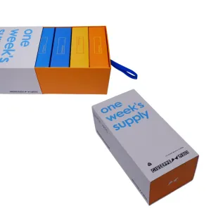
George White Packaging Box
kategorija: Ostale kutije za pakovanje proizvodaPregledi: 1094serijski broj:vrijeme izdavanja: 2025-09-23 09:32:49This product's packaging adopts a classic rectangular prism structure with clean lines and a well-defined form. It not only maximizes space efficiency for convenient transportation and storage but also conveys a stable, professional visual impression. The overall color strategy centers on pure white, applied extensively to create a bright, tidy, and modern tone symbolizing professionalism and reliability. At the base of the box, a subtle orange accent is artfully integrated. This vibrant, warm hue creates a striking yet harmonious contrast with the dominant white. It breaks the potential monotony of a single-tone palette while infusing the minimalist design with approachability and energy, hinting at the brand's proactive and innovative spirit within its professional domain. The visual focal point on the front panel is the clearly printed blue text “one week's supply.” This phrase, literally meaning “one week's supply,” is highly functional, allowing consumers to immediately understand the product's usage cycle and capacity. The choice of blue conveys calmness and rationality; paired with the white background, it appears exceptionally clear and readable, fully embodying the core design principle of simplicity and prioritizing functional communication. This direct information delivery effectively reduces cognitive effort for consumers and enhances usability. Brand information is concentrated on the box's side panel. Here, the brand name “GIUSEPPE 乔治白” is clearly printed in both Chinese and English, ensuring accurate brand recognition and international appeal. Simultaneously, the slogan “THE LEADING BRAND IN UNIFORM” confidently asserts the brand's leadership in the uniform sector, conveying professional credibility and brand strength to customers. Furthermore, the brand's graphic logo is presented alongside textual elements, collectively forming a complete and standardized brand identity system. The embossed printing technique employed on this packaging box is pivotal to its enhanced texture. This process utilizes precision-crafted dies to create raised, textured relief effects on the substrate. Applied to the brand logo or key text elements, it creates tactile, three-dimensional patterns through shadow variations under light—even without ink. This tactile experience elevates the packaging beyond flatness, imparting a subtle, refined artisanal quality. Building upon minimalism, it achieves a refinement in detail. In summary, this packaging design successfully embodies the principle of “form follows function.” Eschewing superfluous ornamentation, it achieves a clean, efficient aesthetic through structured forms, bold color contrasts, straightforward typography, and textured embossing. It accurately conveys the product's core information and the brand's professional positioning, perfectly aligning with the clean, functional aesthetic required for business and uniform sectors. While fulfilling basic protective functions, it subtly showcases the brand's commitment to quality through thoughtful details. -
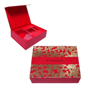
GIVENCHY kutija za pakovanje
kategorija: Ostale kutije za pakovanje proizvodaPregledi: 1045serijski broj:vrijeme izdavanja: 2025-09-23 09:32:58Kutija za pakovanje ovog proizvoda koristi sofisticiranu kombinaciju dvije tehnike tiska: mat laminacije i štancanja folijom, koji zajedno stvaraju njegovu izuzetnu teksturu i vizualnu privlačnost. Prvo, cijela površina kutije je prekrivena slojem osjetljivog mat filma. Ovaj proces ne samo da značajno povećava trajnost ambalaže, pružajući praktične funkcije kao što su otpornost na ogrebotine i otpornost na otiske prstiju, već što je još važnije, daje meku, nenaglašenu mat završnu obradu površini. Ova tekstura je topla i glatka na dodir, podsjeća na fine tkanine koje se koriste u vrhunskoj odjeći po mjeri. Odmah uspostavlja nenametljiv luksuzni ton za pakovanje, izbjegavajući jeftinoću koja se često povezuje sa sjajnim završnim obradama, dok predstavlja prefinjenu i sofisticiranu estetiku. Nasuprot ovoj mat podlozi, dizajn uključuje blistavo štancanje vrućom folijom. Tijelo kutije ima bogatu, autentičnu crvenu boju—simbol strasti i sreće koja također prenosi klasičnu plemenitost. Ovo crveno nadopunjuju pomno dizajnirani zlatni cvjetni uzorci. Ovi uzorci nisu samo štampani već se postižu preciznim vrućim štancanjem folijom, gdje metalna folija čvrsto prianja na površinu kutije, stvarajući zasljepljujuće sjajne, oštro definirane trodimenzionalne motive. Spajanje crvene i zlatne predstavlja bezvremensku kombinaciju u estetici boja - prva je postojana i vatrena, druga briljantna i raskošna. Zajedno čine upečatljiv, ali harmoničan vizuelni kontrast, značajno pojačavajući osećaj luksuza i umetničkog uticaja pakovanja, čineći ga nezaboravnim na prvi pogled. Dizajn kutije je posebno rafiniran. U vizuelnom centru, prolazi crvena ukrasna vrpca, element dizajna koji je pametno inspirisan stilom vrpce vrhunskih poklon kutija, dodajući slojeve dubine i osećaj ceremonije. Iznad trake, naziv brenda je jasno odštampan crnom bojom. Izbor crne je majstorski izveden. Kao najizraženija neutralna boja, djeluje izuzetno postojano i upečatljivo na crveno-zlatnoj pozadini. Ovo efektivno poboljšava prepoznatljivost brenda, istovremeno izbjegavajući vizualni nered koji druge boje mogu unijeti, osiguravajući da cjelokupna estetika ostane čista i sofisticirana. Sve u svemu, dizajn ambalaže postiže savršen balans između snage i mekoće, tradicije i modernosti. Cvjetni motiv služi kao kruna – njegove nježne linije i romantične forme daju vrhunsku estetiku daškom gracioznosti i topline, sprječavajući pretjerano krut ili formalan izgled. Ovo omogućava pakovanju da odiše luksuzom, a da pritom zadrži emocionalno privlačnu privlačnost. Ovaj prefinjen i elegantan jezik dizajna, od nenametljive teksture mat filma do blistavog sjaja štancanja folijom, i klasične kombinacije boja crvene, zlatne i crne, vidi svaki detalj pažljivo promišljen kako bi zajedno stvorio izvanredan vizualni učinak. Više od obične posude za pakovanje, služi kao produžetak identiteta brenda, savršeno usklađen s njegovom inherentnom modom i luksuznim DNK. Ovaj dizajn uspješno jača premium i profinjen imidž brenda u glavama potrošača.


vijesti
Klasifikacija:
Još nema rezultata pretrage!
slučaj
Klasifikacija:
Još nema rezultata pretrage!
video
Klasifikacija:
Još nema rezultata pretrage!
skinuti
Klasifikacija:
Još nema rezultata pretrage!
regrutovanje
Klasifikacija:
Još nema rezultata pretrage!
Preporučeni proizvodi
-
NEWS
George White Packaging Box
Nauči više -
NEWS
GIVENCHY kutija za pakovanje
Nauči više


 Telefon